Logo Designs
At Alby Digital, our mission is to bring your brand vision to life. Whether you’re developing a company, organization, or personal website, we’re here to provide expert design and support that will elevate your online presence. A strong brand starts with a professional look, and we believe that great logo design is essential. We’ll work closely with you to create a logo that reflects your brand’s values and makes a lasting impression on your audience.
Our team uses only the very best software and tools to ensure each project meets the highest standards. From website design to graphic elements, our solutions are crafted with precision and an eye for innovation. Our focus is not only on delivering quality but also on providing a seamless, collaborative experience for our clients.
Tallaght Sports Complex Logos
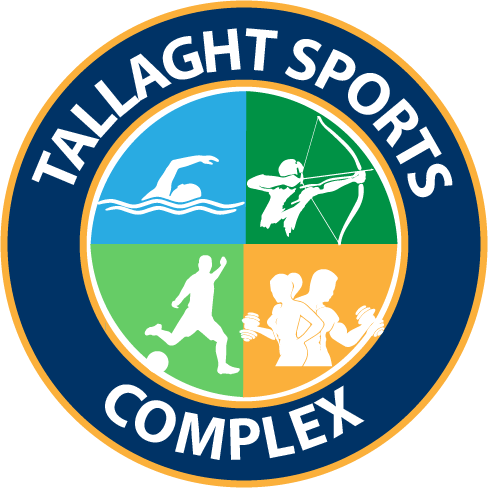
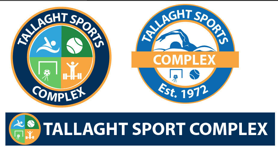
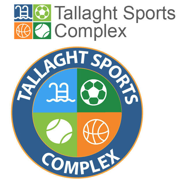
Alby Digital recently had the opportunity to design a logo for Tallaght Sports Complex, capturing the diversity of activities offered at the facility. We focused on creating a clean, modern design that highlighted the complex’s vibrant sports offerings. To ensure clarity and an intuitive feel, we selected four primary icons—swimming, archery, football, and gym—to represent the variety of sports available. Each icon was color-coded for easy identification: blue for swimming, green for archery, orange for gym, and green for football, conveying a sense of dynamism and energy.
The icons were arranged on a dark blue circular background, symbolizing unity and the all-encompassing nature of the complex. The deep blue background also added a sense of professionalism and calm, balancing the bright icon colors and giving the logo a cohesive look. Above the icons, we placed the text “Tallaght Sports Complex” in a clear, modern font, ensuring it was easy to read at a glance. The design emphasizes inclusivity and invites everyone to engage in the various activities offered at the sports complex.
Overall, this logo design aimed to visually communicate the active, community-centered spirit of Tallaght Sports Complex, making it instantly recognizable. By pairing each sport with its own color, we achieved a design that was both visually appealing and practical, offering a memorable branding solution that aligns with the complex’s goals.
Dublin Art Classes logo
Alby Digital recently took on an exciting project to design a logo for Dublin Art Classes, a creative initiative established by John Carpenter. Our design process began with an exploration of different artistic styles that would convey the essence of a modern art education centre while also appealing to a wide audience. Given the focus on foundational art skills, we opted to work with the primary colours—blue, red, and yellow—as a nod to the basics of colour theory and artistic principles.
To frame these colors, we experimented with black borders, creating bold, structured lines that served to organize and define the design elements, adding a clean and modern touch. Our inspiration for this project came largely from the works of Piet Mondrian, whose unique compositions use strong lines and primary colors to create visual harmony. We studied Mondrian’s style carefully, incorporating elements of his abstract simplicity to ensure the logo would be both eye-catching and timeless.
By integrating these primary colors with black borders, we developed a logo that embodies creativity, structure, and approachability. The design reflects the mission of Dublin Art Classes to teach fundamental art skills while encouraging creativity. It is a balanced yet vibrant design that resonates with artists and art enthusiasts alike, creating an inviting first impression of the classes. This approach allowed us to produce a logo that both celebrates the tradition of visual arts and aligns with the innovative, inclusive spirit of John Carpenter’s vision.

Enable EVNO Logos
Alby Digital was tasked with designing logos for Enable EVNO, an organization focused on innovative solutions. For this project, we chose to work with a color palette of blue and green, each symbolizing key values we wanted to convey. Blue is often associated with trust, reliability, and stability—qualities essential for establishing confidence in a brand. Green, on the other hand, represents growth, renewal, and eco-consciousness, which aligns well with an organization focused on forward-thinking initiatives.
In our design process, we explored various ways to integrate these colors effectively, balancing them to create a sense of harmony and progression. Blue formed the primary base, providing a sense of dependability and professionalism, while green accents were strategically placed to highlight Enable EVNO’s commitment to growth and sustainability. This blend of colors not only gave the logo a vibrant and approachable look but also spoke directly to the brand’s values.
Additionally, we considered elements like clean lines and simple shapes to maintain a modern, minimalist aesthetic. This approach ensured that the logo would be versatile and easily recognizable across different mediums and sizes, from business cards to digital platforms. The result was a logo that projects Enable EVNO as both trustworthy and growth-oriented, encapsulating the organization’s mission in a visually appealing and meaningful way. Alby Digital is proud to have developed a design that reflects Enable EVNO’s goals, leaving a lasting impression that embodies their brand values.


UUTEL Logo Designs
Alby Digital was approached to design logos for UUTEL, a Pan-European switchless reseller focused on telecommunications solutions. For this project, we selected a color scheme of purple and orange, chosen to create a balance of professionalism and energy that reflects UUTEL’s dynamic presence in the tech industry.
Purple, often associated with innovation, wisdom, and quality, served as a strong base colour. It conveyed a sense of reliability and depth, crucial for a brand dealing in high-tech, international telecommunications. Orange, on the other hand, injected energy and warmth into the design, symbolizing creativity and enthusiasm. This complementary colour pairing allowed the logo to stand out while representing UUTEL’s cutting-edge services and approachability within a highly competitive market.
During the design process, we explored layouts and shapes that would visually communicate UUTEL’s role as a switchless reseller, highlighting the company’s ability to provide seamless connectivity solutions. The interplay of purple and orange in the design gave the logo a bold, memorable look, ensuring it would be recognizable across various platforms, from digital interfaces to print materials.
The end result was a logo that not only encapsulates UUTEL’s brand identity but also resonates with its audience, projecting an image of both stability and modernity. Alby Digital is pleased to have crafted a design that aligns with UUTEL’s mission and leaves a lasting impression in the telecommunications field.



Tallaght Masters Swim Team Logos
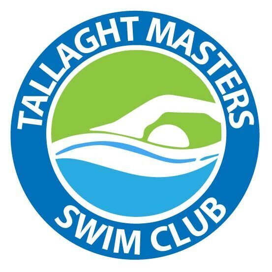
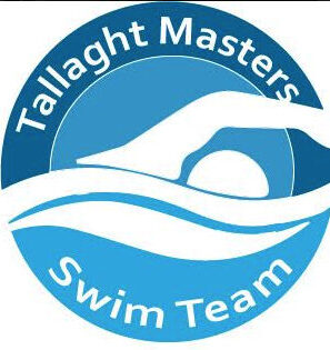
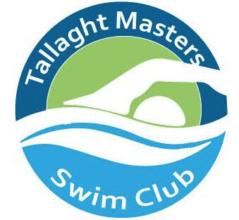
Alby Digital had the opportunity to design a logo for the Tallaght Masters Swim Team, focusing on a circular design that would be versatile for branding across shirts, hats, and various merchandise. The circular shape was chosen specifically for its adaptability, ensuring the logo could be easily displayed on a wide range of items, creating a cohesive team identity.
For the color scheme, we selected black and orange as the primary colors. Black conveyed strength, endurance, and professionalism, resonating with the team’s competitive spirit. Orange added energy, warmth, and a bold contrast that made the logo eye-catching and lively. Together, these colors created a strong, recognizable look for the team.
To complement the primary colors, we incorporated blue and green as secondary accents. Blue, symbolizing water and calmness, naturally aligned with swimming, subtly reinforcing the team’s aquatic focus. Green added a touch of vibrancy and growth, representing progress and unity. The combination of these colors allowed the logo to reflect both the intensity and the community spirit of the Tallaght Masters Swim Team.
The design incorporated streamlined lines and shapes to represent movement and fluidity, capturing the essence of swimming. Placing these elements within the circle, we achieved a balanced, modern look that is not only visually appealing but also practical for various applications. Alby Digital is proud to have developed a logo that reflects the team’s identity and values, giving them a distinctive and professional brand image for their sporting community.
Alby Digital Logos
Alby Digital recently designed a logo based on the concept that every great product begins with an idea, represented by a light bulb, followed by the design process, symbolized by a pencil. This combination of imagery captures the essence of creativity and the journey from inspiration to execution. The light bulb signifies innovation and the spark of a new concept, while the pencil emphasizes the hands-on work involved in transforming that idea into reality.
In the design process, we explored a variety of colours but ultimately chose dark blue and orange as the primary palette. Dark blue conveys professionalism, trust, and depth, providing a solid base that reflects Alby Digital’s commitment to quality and thoughtful design. Orange, on the other hand, injects warmth and energy into the logo, symbolizing creativity and enthusiasm. This pairing created a visually appealing contrast that makes the logo stand out, while also aligning with the values of innovation and precision.
To further enhance the design, we incorporated clean, modern lines and minimalistic shapes, ensuring the logo would be versatile across different applications, from digital platforms to printed materials. By balancing the light bulb and pencil elements with our chosen colours, we created a logo that not only represents the creative process but also embodies Alby Digital’s dedication to thoughtful, impactful design. This logo serves as a reminder that great products start with a spark of imagination and a dedication to bringing ideas to life.


Various Designed logos
Alby Digital has had an exciting year designing a wide variety of logos for an array of clients, each project tailored to reflect the unique identity and needs of each brand. With a focus on creativity, precision, and client collaboration, we approached each logo as an opportunity to bring a brand’s vision to life visually.


